



Endurant: display typeface
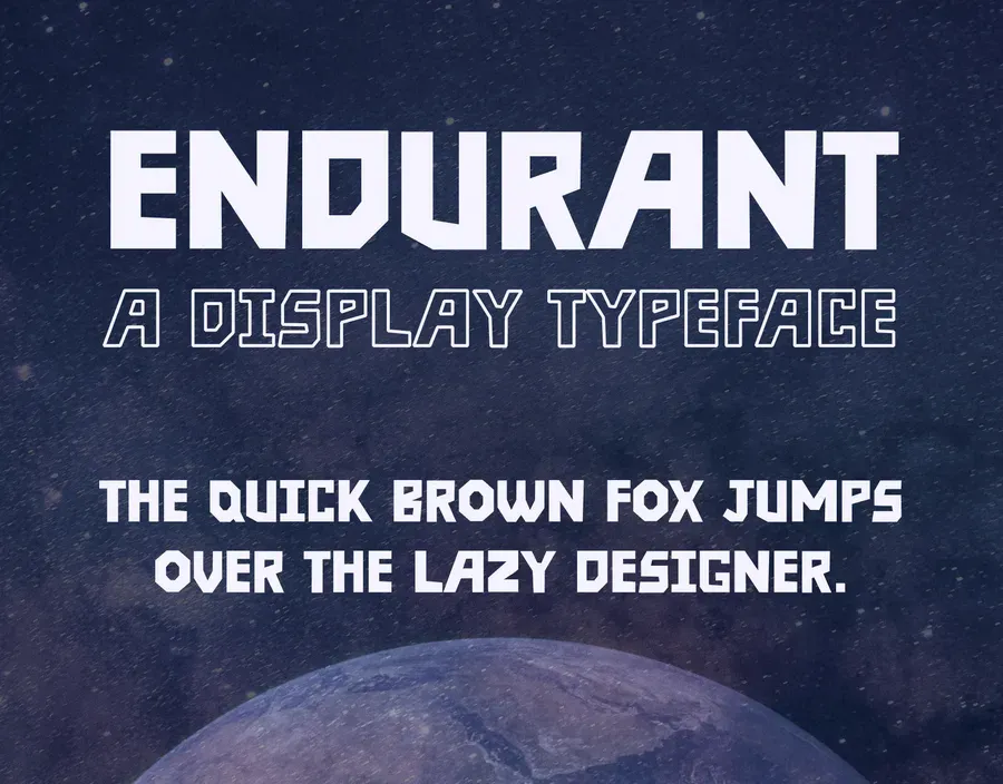
An all-caps display typeface built on late-20th-century futurism, released commercially through MyFonts in Regular and Outline.
The brief
Endurant started from a question with no client attached to it: what would a futuristic typeface look like if it had been imagined in the late 20th century, by someone who had never seen the actual future? That is a specific flavour of futurism. Confident, geometric, and wrong in ways that have since become charming.
What I made
An all-caps display face. All caps was a decision, not a shortcut. The look depends on every letter occupying the same band and building one unbroken horizontal run, and lowercase, with its ascenders and descenders, breaks exactly that. A face like this earns its keep in a poster headline or a title card, where it gets set once and set large, so I optimised for that instead of pretending it could hold a paragraph.
Two styles shipped, Regular and Outline. Outline is not a decorative extra. It is the release valve: the thing you set the second line in once a headline of solid caps has already spent all the contrast a layout has.
I released it commercially through MyFonts. That part was a useful discipline. A font you sell has to survive strangers using it in ways you never pictured, which means the spacing gets tested against letter pairs you would never type yourself.