

Blockdaemon: ETH Protocol
Repositioning Blockdaemon's most-read protocol page into a templated system that every other protocol could inherit.
- 8
- stakeholder and sales interviews
- 1
- protocol template every page inherited
- 3
- surfaces redesigned
Context
Blockdaemon is a leading blockchain infrastructure platform in the Web3 space, empowering businesses to quickly deploy and iterate innovative blockchain applications. It takes complexity out of blockchain through easy configuration, monitoring for high availability, and institutional-grade security.
A protocol is the set of standards governing a blockchain network: transaction validation, consensus, network communication, data storage. Nodes are the devices that maintain that network’s integrity. Staking is where crypto holders lock up cryptocurrency to take part in validation and consensus. Blockdaemon’s Protocols pages were where enterprise buyers went to understand which of these it supported, and how. I worked on Phase 1 of ETH Protocol: Repositioning and Awareness.
The problem
In mid-2022, Ethereum was by far the most popular protocol among Blockdaemon’s enterprise clients, and its page was the one they read before contacting sales. It was also out of date.
Most protocol pages were. The design and content no longer reflected the latest offerings, and the ETH page in particular said nothing about recently launched APIs, including the NFT API. It was long, heavy with text, light on visuals. The result was an awareness gap: enterprise clients didn’t know what had shipped, and fewer qualified leads were reaching sales.
The objectives were to redesign the page to reflect the latest APIs and offerings while improving its visual appeal and reducing clutter; to generate awareness among enterprise-level clients about the new offerings; and, by achieving those two, to increase the number of qualified enterprise leads.
My role
I ran this end to end, and the split between what I drew and what I put into production matters here.
What I designed: the research plan and eight interviews; the competitive analysis; the persona and journey map; hero, features, CTA-and-trust, and contact-and-FAQs sections for the protocol page; a dedicated NFT API page; a full email newsletter redesign; and a new blog cover system.
What I built and shipped: the protocol page as a template rather than a page. I’d authored an MVP style guide months earlier to fix the inconsistencies creeping across our site designs, and this project was where I put it to work as a component system: one templated page with defined slots for per-protocol stats, offerings and copy, so the pattern held while each page stayed customisable. I also produced the 3D artwork the newsletter and covers were built from, and wrote the blog cover guidelines and templates the team used afterwards. Engineering took the template and rolled the remaining protocol pages onto it.
Approach
Eight interviews. Five internal (two product managers, two marketing associates, the head of marketing) covering what was launching, what already existed, and how much Web3 technical knowledge the audience really had. Three with sales associates: what enterprise clients need from blockchain APIs, which metrics they prioritise when evaluating a protocol, what makes choosing a vendor hard, and which emails, pitch decks and one-pagers had produced good outcomes. Those conversations went onto an affinity map.
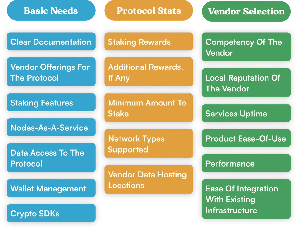
Competitive analysis turned up four things a protocol page had to carry: a feature list and details section backed by strong visuals; stats like staking rewards and additional rewards; a blog posts section to establish trust; and a docs section so clients could review technical documentation before a purchase decision.
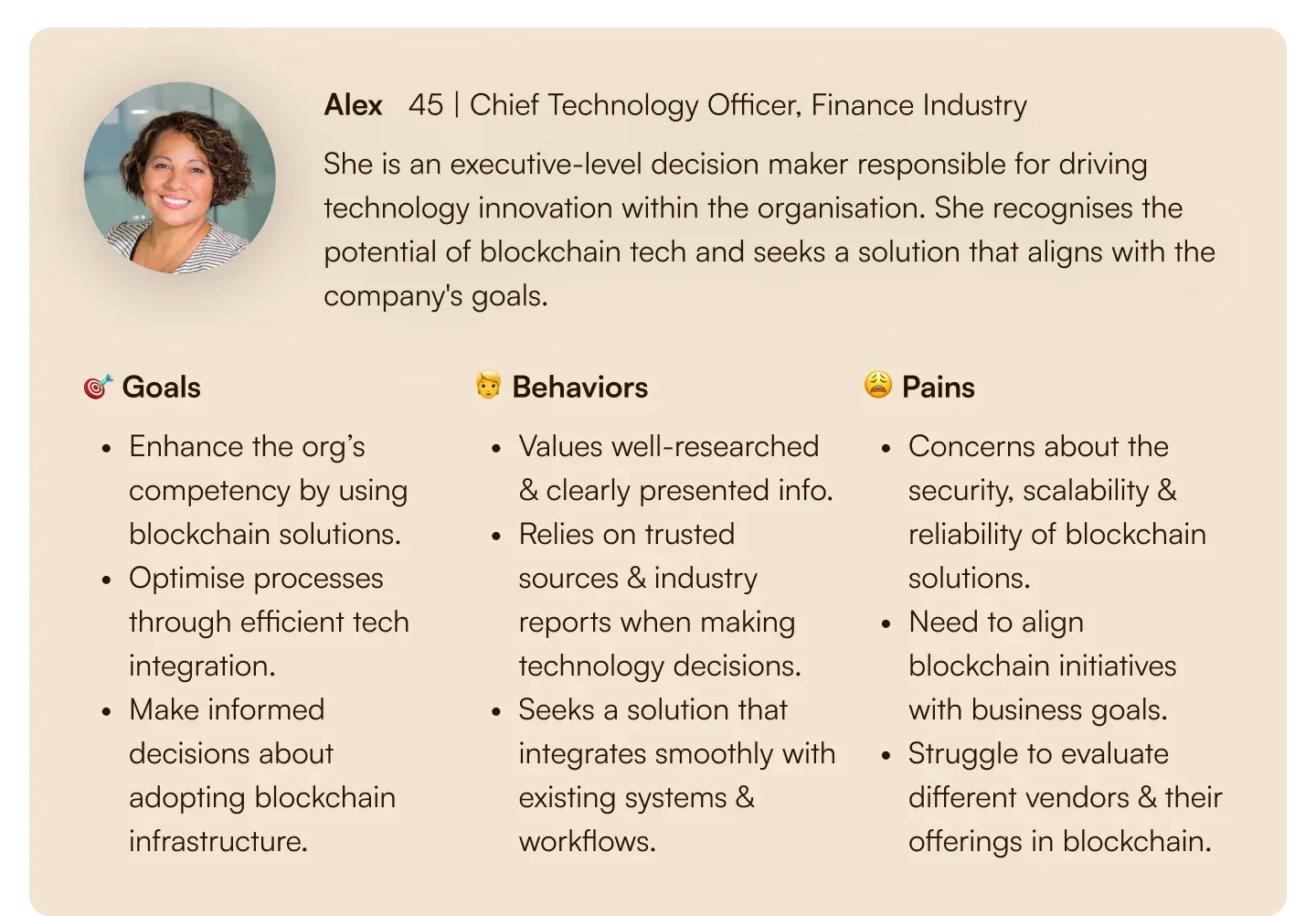
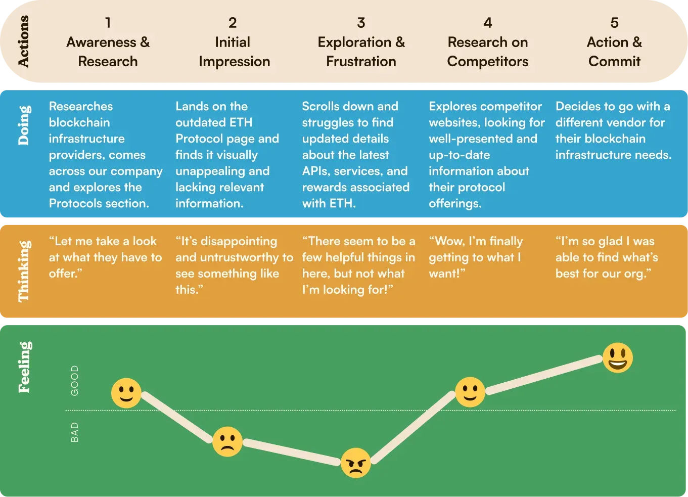
Alex, the persona, and a journey map of how Alex picks a vendor aligned product and marketing. The question became: how might we showcase the ETH Protocol page to increase awareness and attract executive-level decision makers, driving qualified leads?
Building it
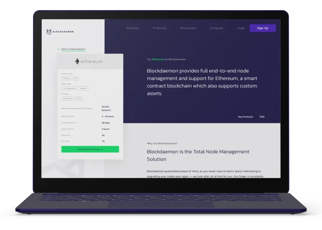
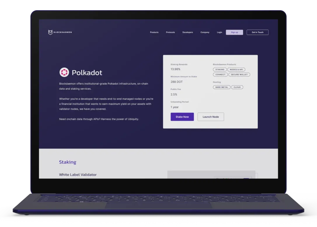
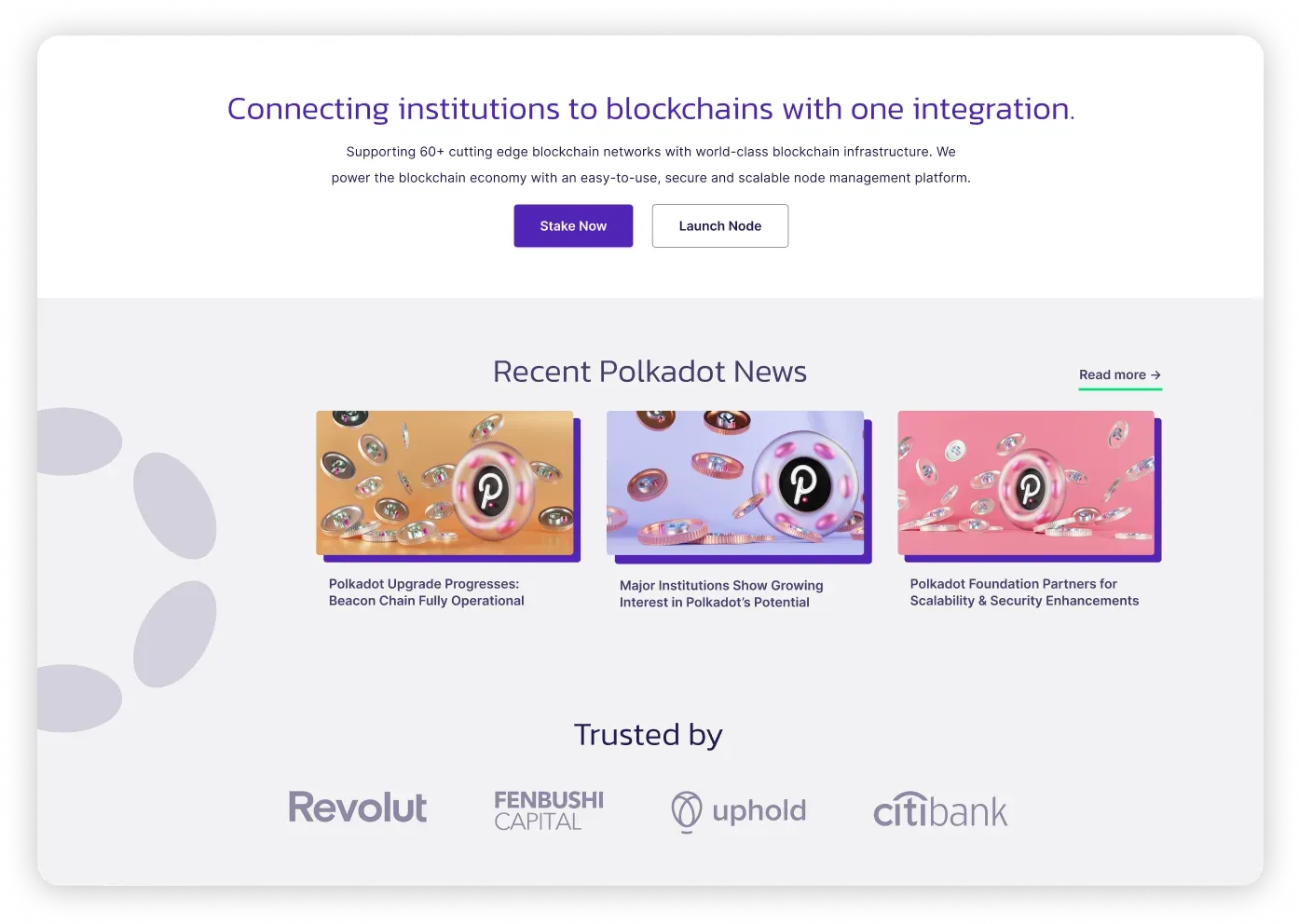
I designed the template against the Polkadot protocol first, as a deliberate placeholder. If the system flexed for a protocol it wasn’t designed around, it would flex for the rest.
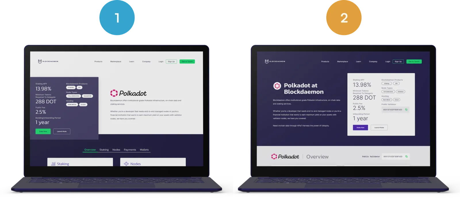
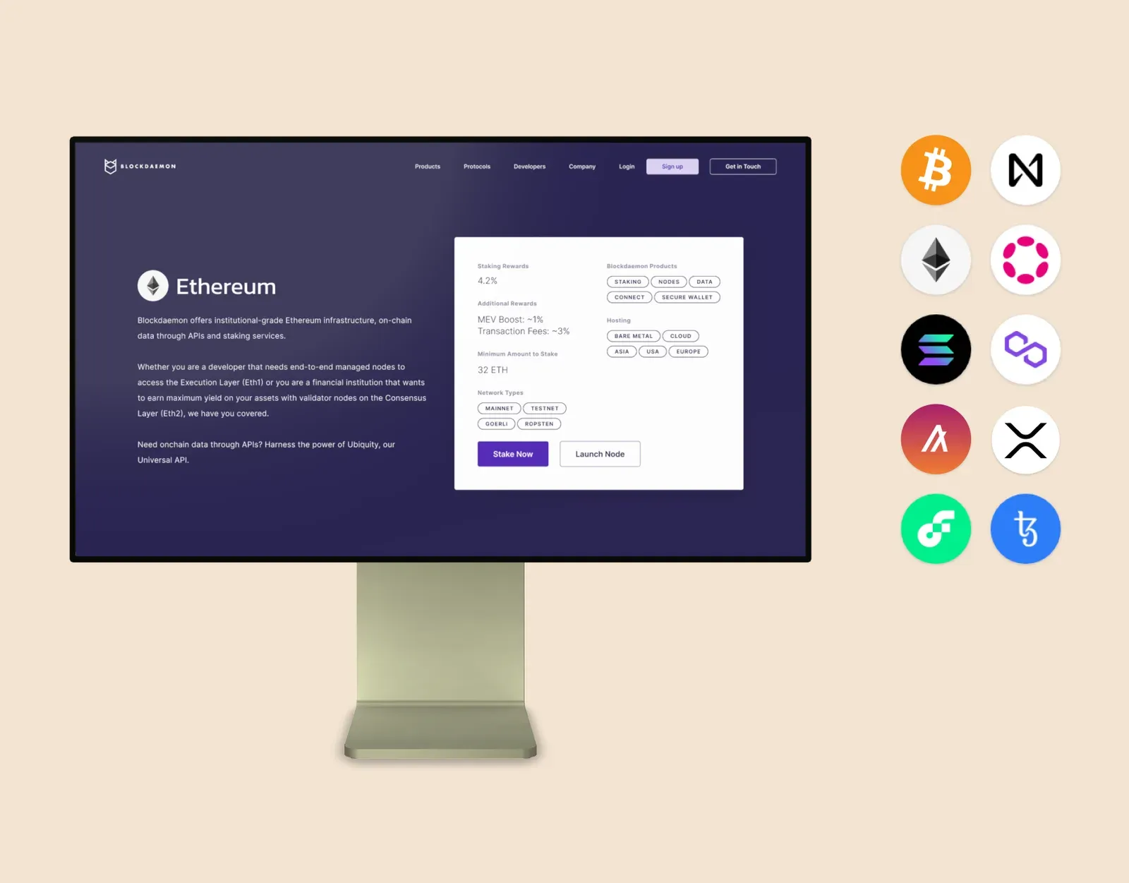
The old hero crammed in stats that cluttered the page and weren’t the ones clients evaluated on, and its copy didn’t cover the latest offerings. Of two options, the second highlighted stats far better: protocol description left, stats right, following the natural reading pattern. I then toned the stat typography down so the hierarchy didn’t tip over.
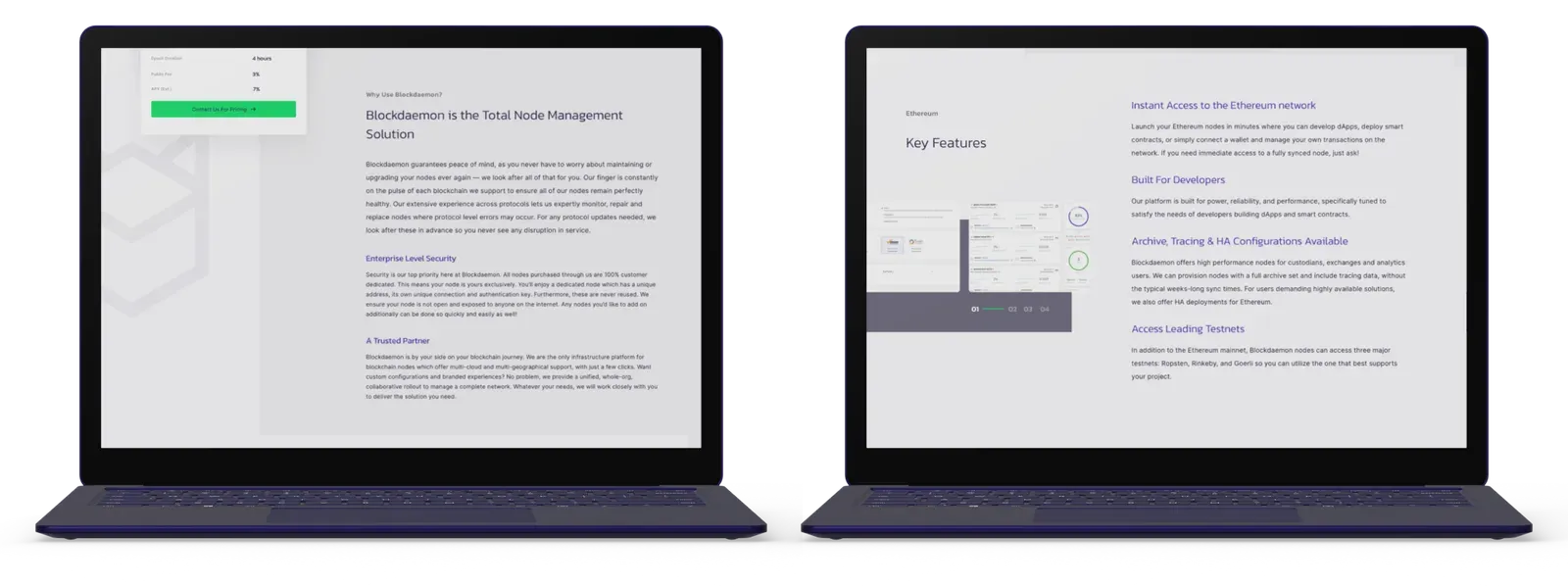
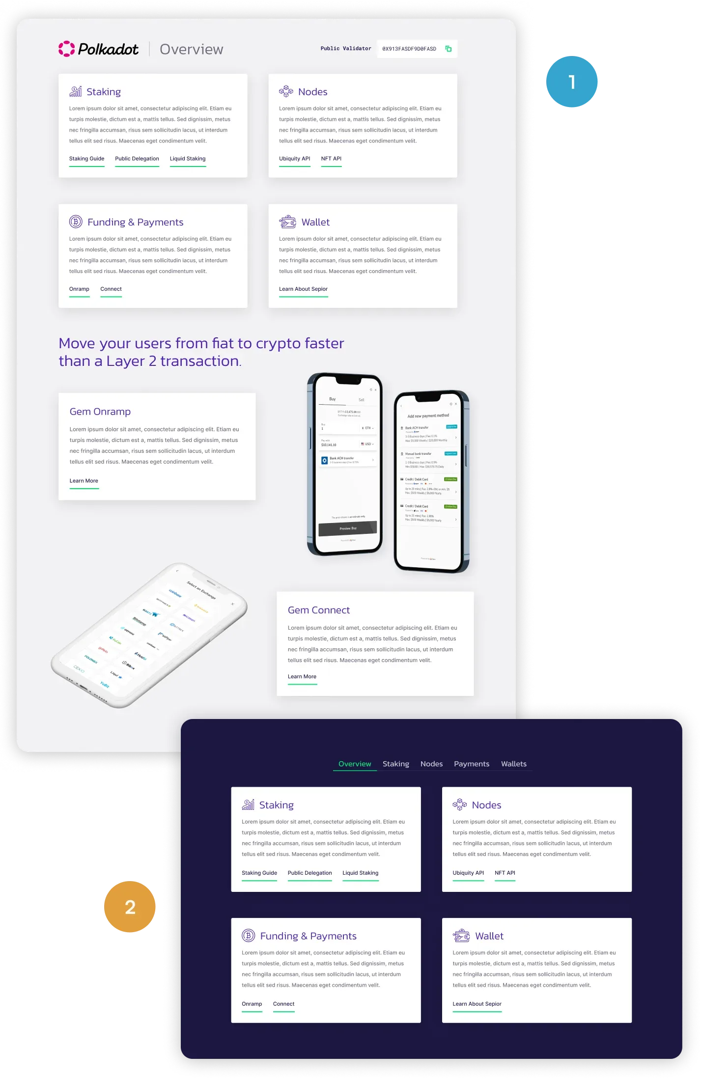
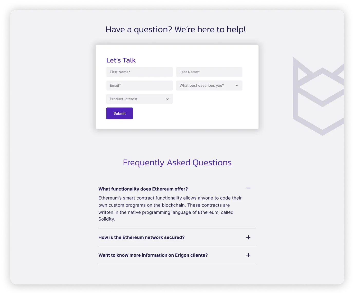
The features section had been dense text with a single supporting visual, missing key offerings including staking and the NFT API. One option led image-rich with every offering upfront; the other used multi-tab icon cards. The first won because it told a cohesive story: offerings ordered by the target client’s priority, good supporting visuals, tertiary buttons out to the docs. Below it sat CTAs to stake ETH or launch a node, the blog section and current client logos, then contact and FAQs.
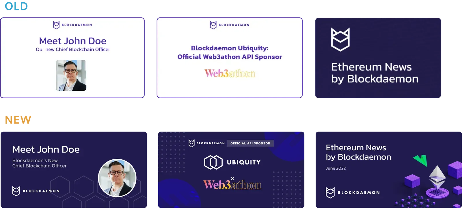
The newsletter had been text with a logo on top. I built 3D assets for the header image, and those assets ended up accelerating design production well beyond email: blog covers, YouTube thumbnails, event materials. Blog covers were inconsistent in design and frame size, mostly plain text on white, too unpolished to hold attention in a social feed; they got a new visual system with guidelines and templates behind it.
Outcome
Every protocol page was revamped on the new template, the redesigned newsletter went out, and recent blog posts were refreshed with the new covers. Engagement and conversion were tracked closely; those figures are confidential and withheld here.
What the work was for is simpler to state: ensuring target clients could easily grasp the core offerings, compare vendors, and confidently inquire about the services, with the newsletter and blog posts establishing trust and credibility around it. The 3D artwork guidelines the project produced kept the visual language cohesive for the design team afterwards.
What I’d do differently
None of the research touched an actual enterprise client. Sales was a good proxy and an honest one, but it’s still second-hand. I’d push for two or three conversations with real buyers before committing to a stat set.
The competitive analysis put a docs section in the top four requirements, and the template shipped with tertiary links to docs rather than a proper entry point. Right call for two months, wrong call for the year after.
And the template went out ahead of a written component spec. The engineering rollout to the remaining protocols worked, but a spec would have made it faster and left fewer decisions to be re-litigated per page.