
Groot: brand identity
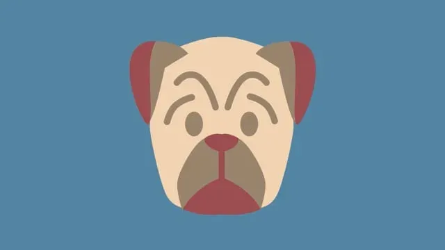
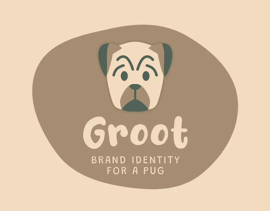
A brand identity for Groot, a pug, built on the specific face rather than on the breed, and drawn to survive being embroidered onto small moving objects.
The brief
The client is a pug. His name is Groot, he was represented in every meeting by his humans, and the brief arrived in the shape a brief always arrives in: this is who he is, this is who he is not, this is what we want people to feel when they see him.
Who he is not turned out to be the useful half. Not a cartoon. Not a stock silhouette of a generic dog holding a bone. Pugs are already a shorthand, and a mark that leans on the shorthand is a mark about pugs rather than a mark about this one.
What I made
The identity is built on the specific face and not on the breed. A pug’s whole geometry is a short list: a flat front, a wrinkle, two wide-set eyes, an underbite. I reduced it until only the parts that are unmistakably him survived, then stopped one step before it turned into a smiley face. That step is where every animal logo goes to die.
The mark is drawn at a single weight so it can be embroidered, printed a centimetre across on a tag, or stamped in one colour. Nothing in it depends on colour to be readable, which is the real requirement when the primary application is small objects attached to a moving animal.