


Primobots: brand identity and 3D art direction
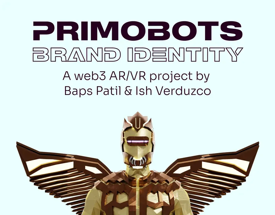
The identity and 3D art direction for the AR/VR Web3 startup I co-founded, drawn flat with the extrusion already in mind.
The brief
Primobots was an AR/VR Web3 startup I co-founded. The product side of it, the 5,555-piece 3D collection, the Snap Lens AR filter and the full-body metaverse avatars, has its own case study on this site. This entry covers only the identity and the 3D art direction sitting underneath all of it.
Founding the company meant I could not hand myself a brief and then complain about it. The constraint I set instead: the brand had to work as a flat two-dimensional mark and as a physically lit 3D object, with neither one looking like a translation of the other.
What I made
The wordmark is geometric and heavy, built from shapes that survive extrusion. That sounds obvious until you extrude a logo drawn with fine strokes and watch the silhouette fill itself in. I drew it flat with the depth pass already in mind: thick verticals, generous counters, one repeated corner radius the 3D bevel could pick up exactly.
Art direction was the other half. I fixed the material vocabulary early, matte plastic and brushed metal, one key light and a coloured rim, and every render in the collection obeyed it. That consistency is what makes thousands of generated variants read as one family instead of as a folder of separate experiments.