


Donn Felker: personal brand identity
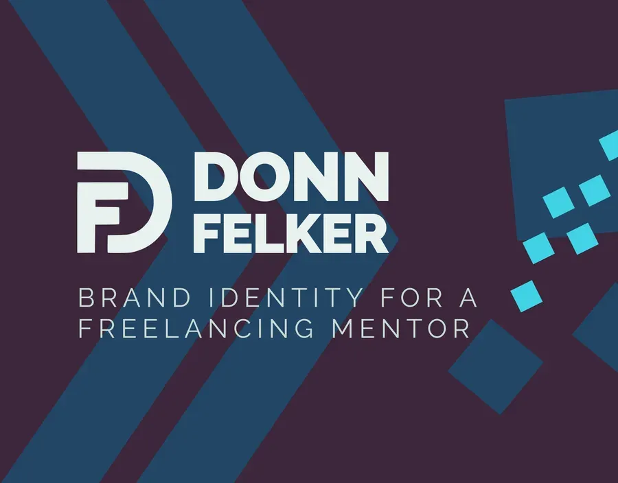
A personal identity for an Android developer, author and course creator, built on the person rather than on any one product line.
The brief
Donn Felker teaches Android development, writes books and runs courses. Three output types, three audiences that barely overlap, one name on all of them. The brief was a personal identity, which in practice meant answering a question first: does the brand belong to the person or to the product line?
What I made
The person. Course brands come and go, books get second editions, and a developer’s platform of choice has a shelf life. The one constant is Donn, so the identity sits on his initials and on nothing that can date.
That ruled out the obvious moves. No Android green. No terminal typeface, no angle brackets, no monospace body copy signalling “this person writes code.” Those read as a costume, and they tie the brand to the exact technology it will eventually outgrow.
What is left is a monogram with a deliberately structural quality: straight strokes, one clean joint, enough weight to sit on a book spine and on a course thumbnail without adjustment. The supporting type is a workhorse sans with a wide weight range, because the same person needs a serious voice for a book cover and a friendly one for a lesson title. Swapping typefaces to get that is how a small brand starts to look like three brands.
The mark is animated for video intros, drawn in the order you would build it by hand.